TAFT X GLISS
Packaging Design
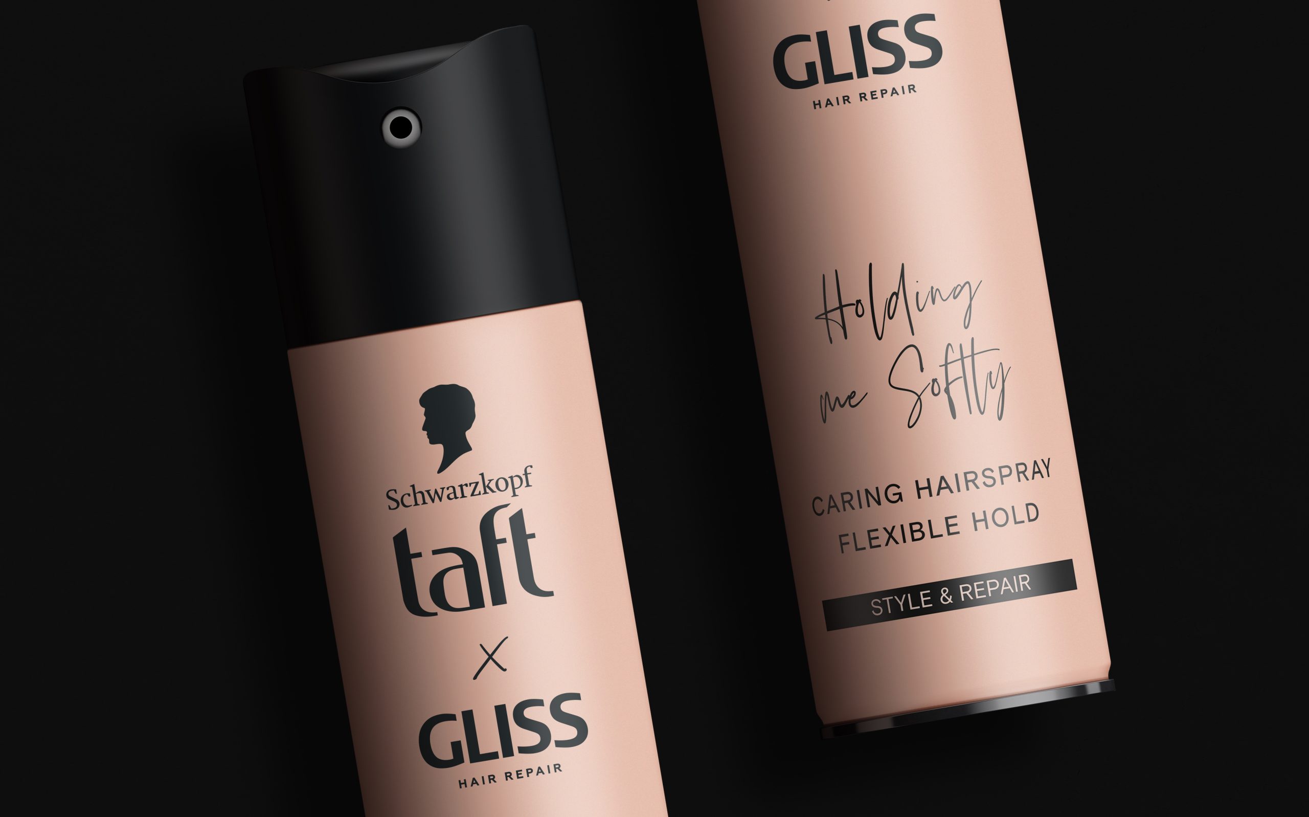
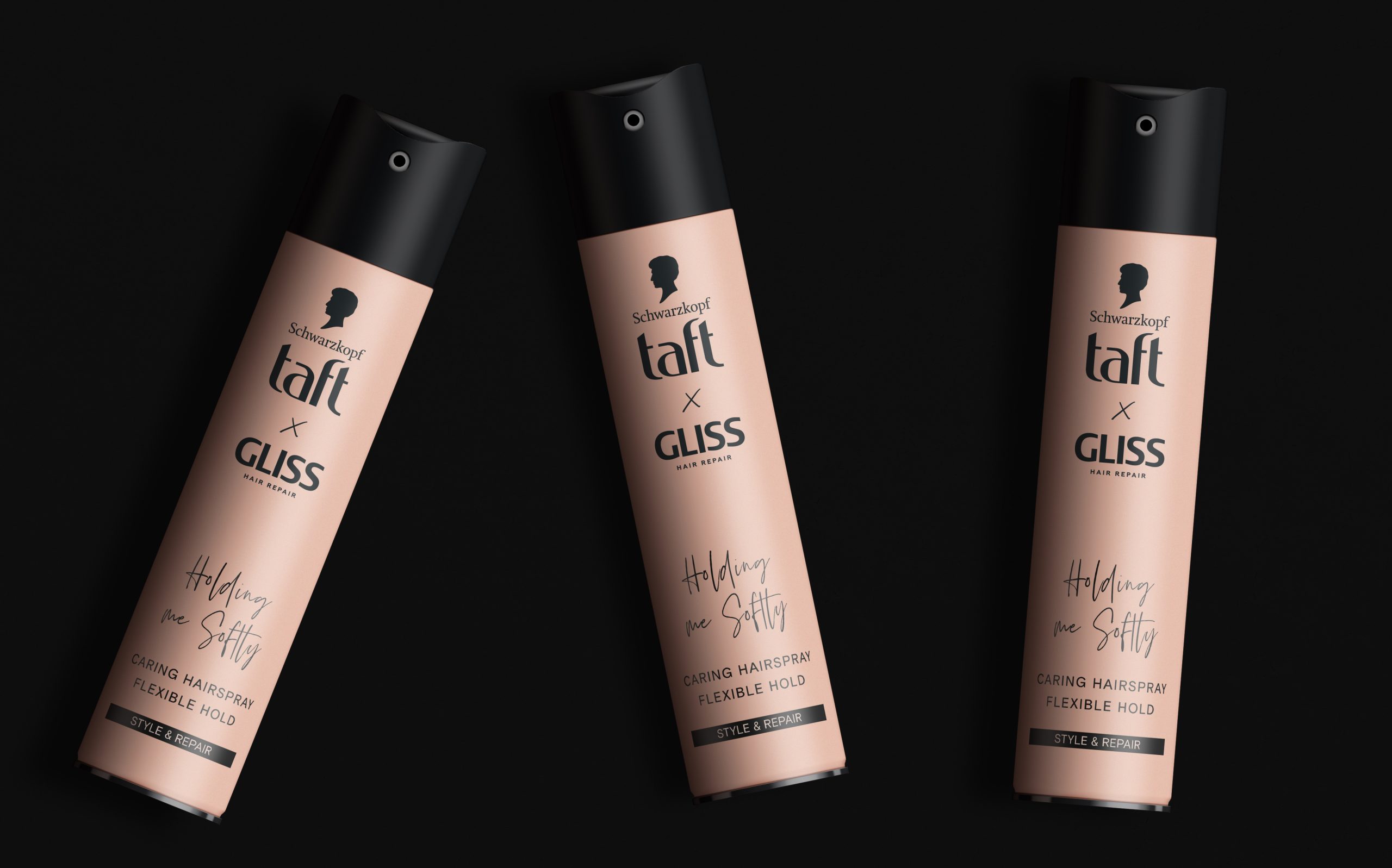
For this Taft x Gliss collaboration, our goal was to create a packaging design that unites the strengths of both brands in a clear, contemporary way. Taft’s high-performance styling and Gliss’s advanced hair care needed to coexist seamlessly, so we developed a visual system that balances efficacy with premium care.
The design emphasizes clarity and shelf impact through a strong typographic hierarchy and a color palette that combines Taft’s energetic character with Gliss’s sleek, restorative feel. Contrasting tones and refined finishes help the packaging stand out while elevating perceived quality.
Every element—from material textures to iconography—was considered to communicate benefits intuitively and inspire consumer confidence. Overall, the design confidently presents Taft x Gliss as the go-to solution for style and care without compromise.
Ström & Jag was responsible for the design, color selection, typefaces and also the way Taft and Gliss would look as a lock-up.