Kord
Visual Identity
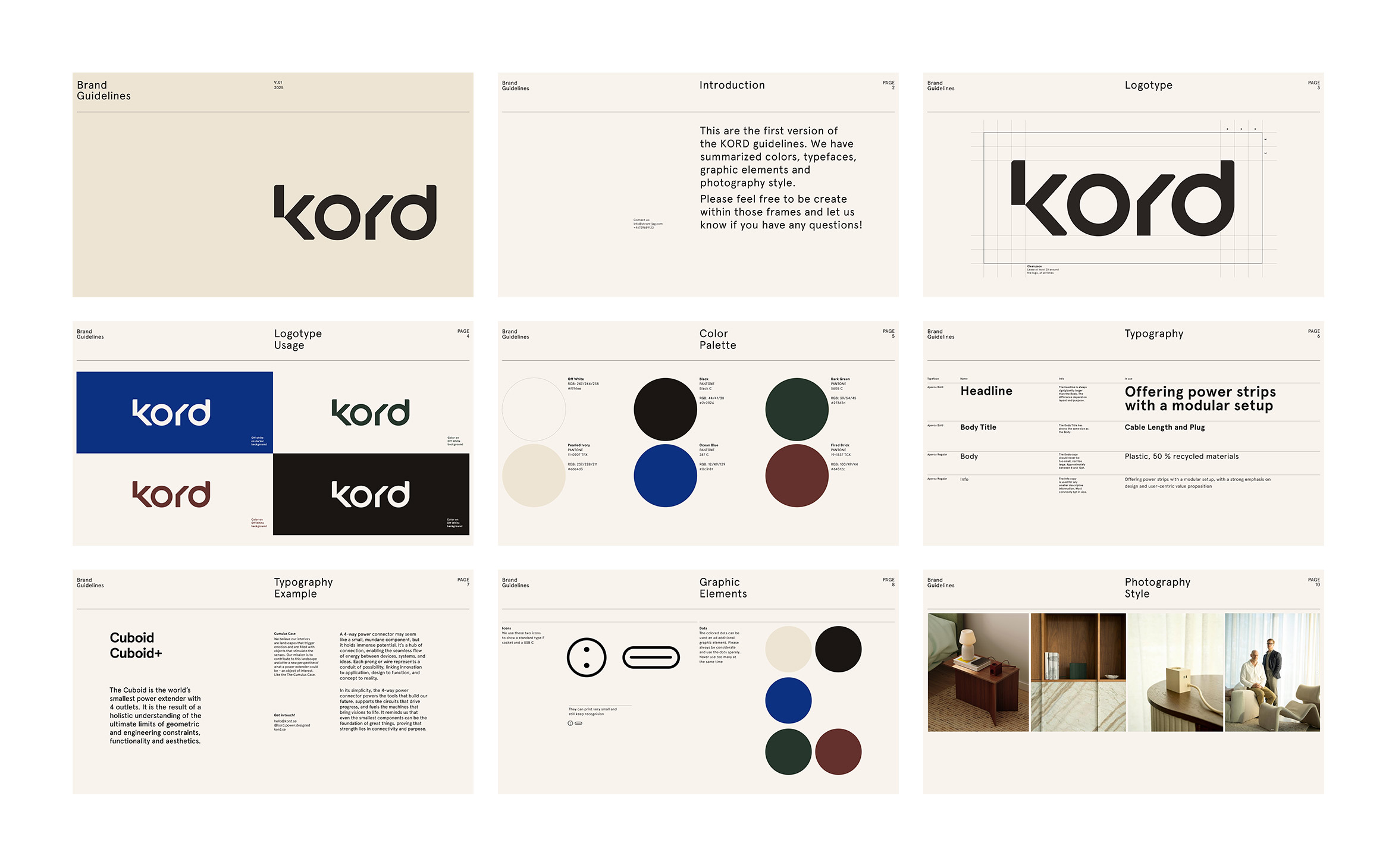
Kord approached us with the ambition to distill their essence into a visual language—one that feels both contemporary and enduring. From the outset, our goal was to create an identity system that balances clarity with character and resonates across digital and physical touchpoints.
Conceptual Approach:
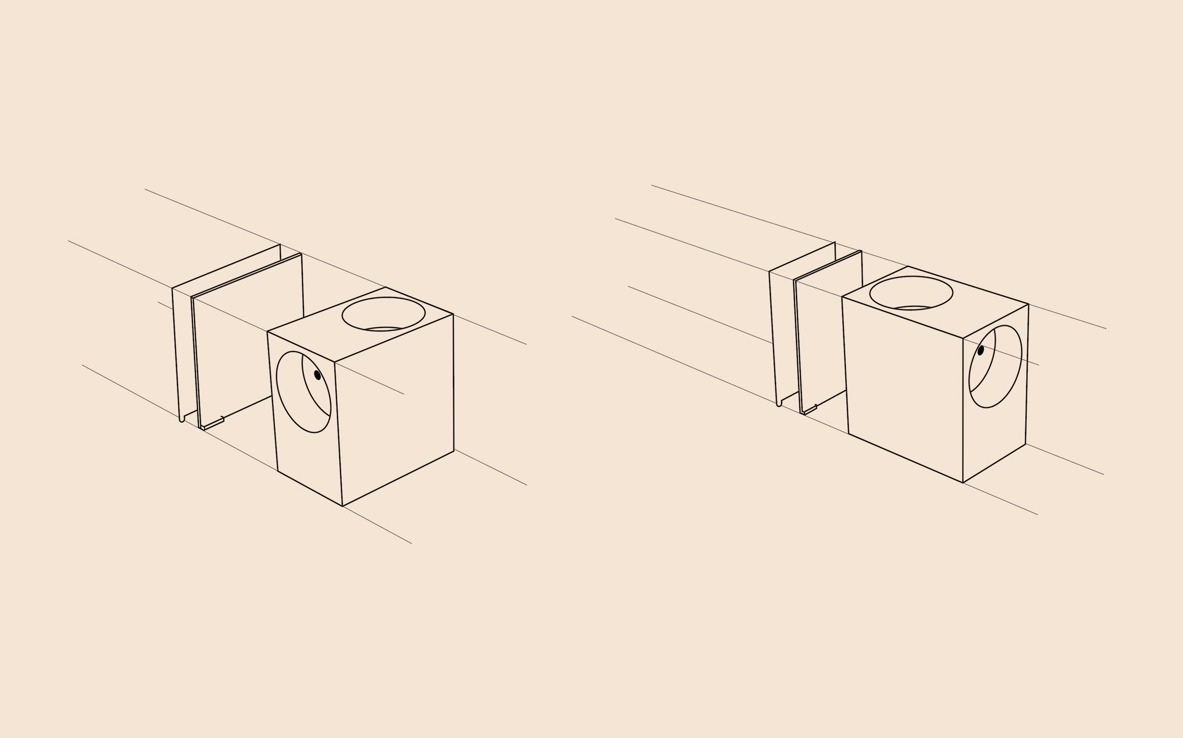
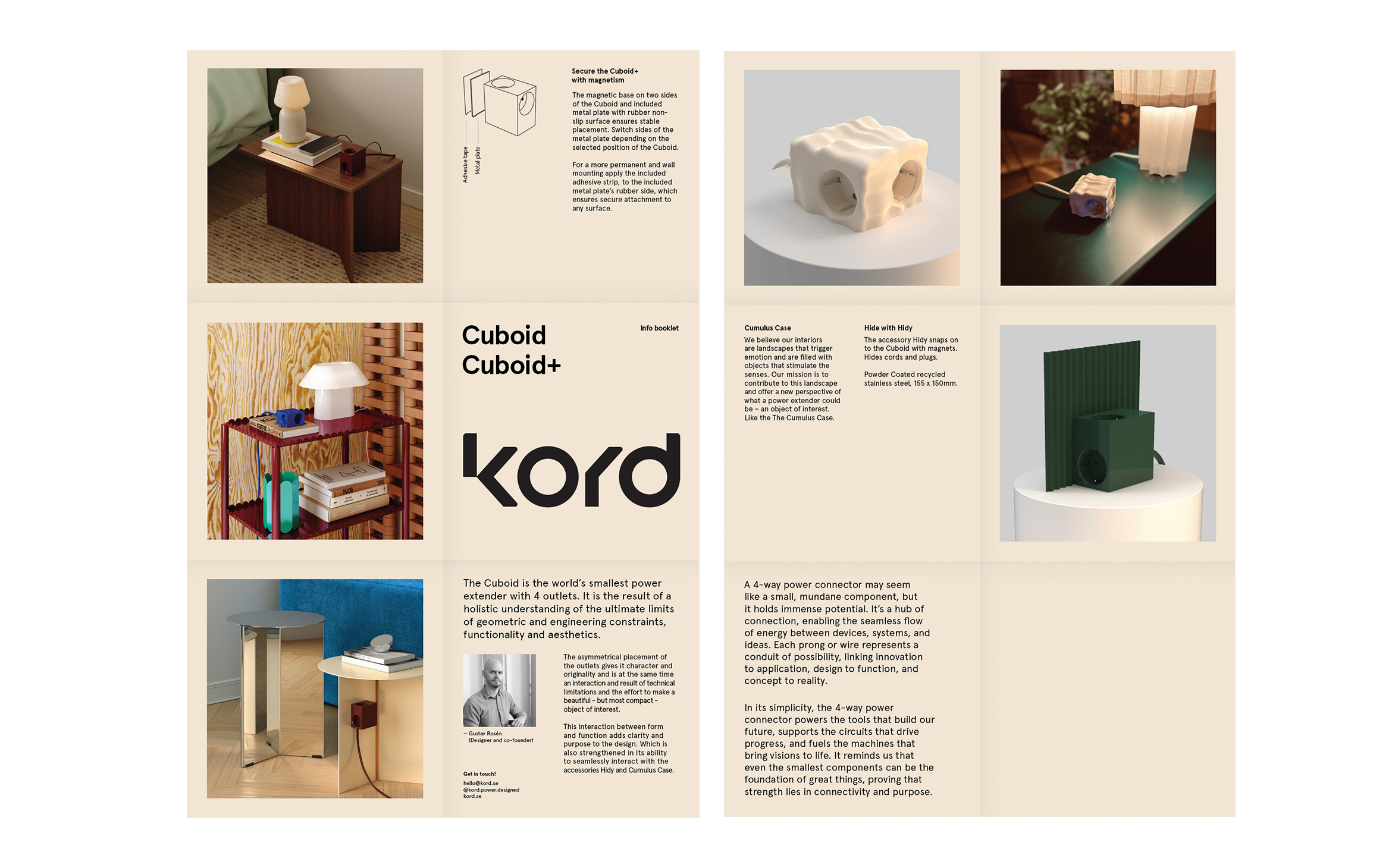
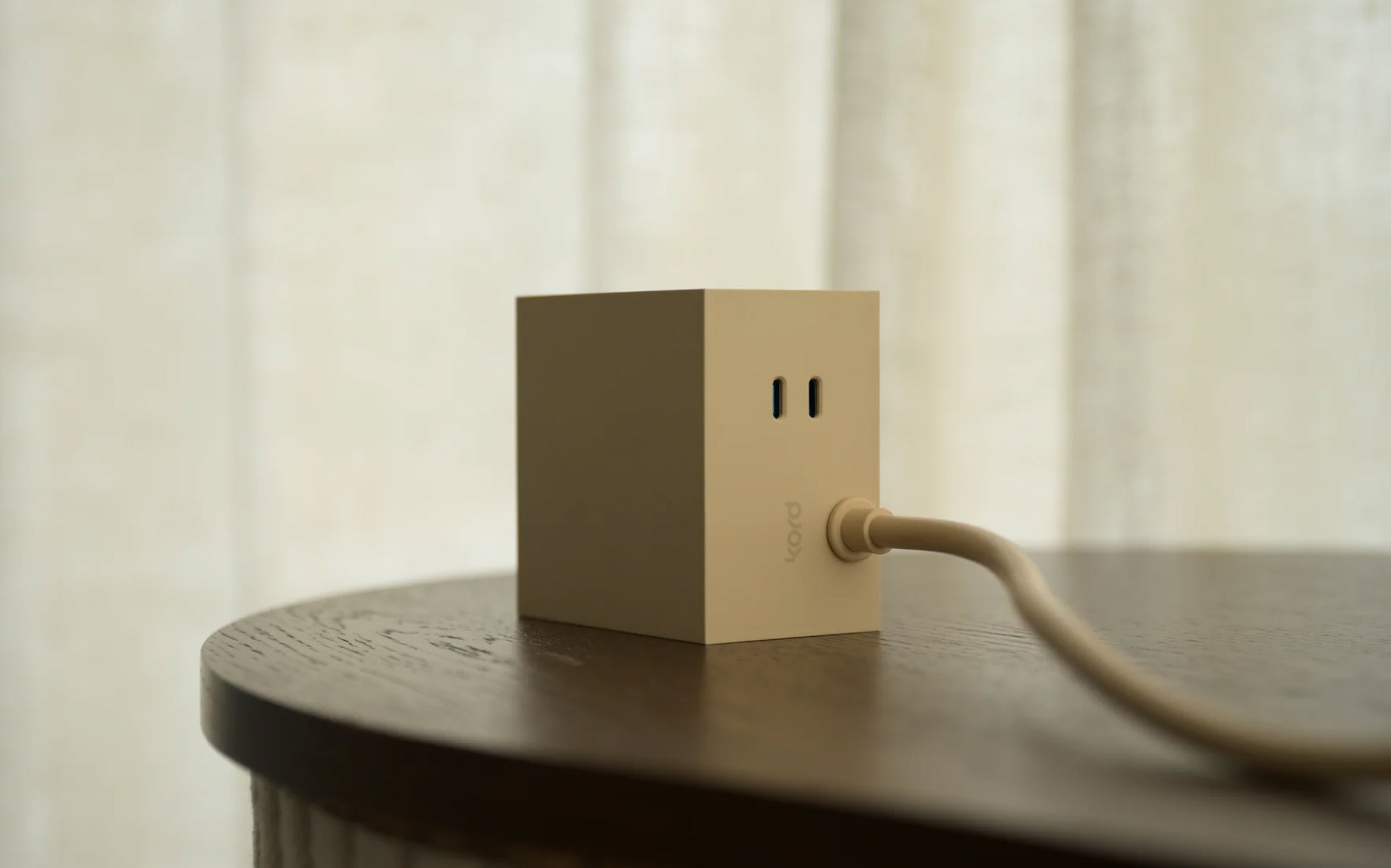
At the core of the project was the idea of connection. Kord, by name and nature, implies links, threads, and relationships. We explored countless visual metaphors of line, tension, and structure to inform the design language.
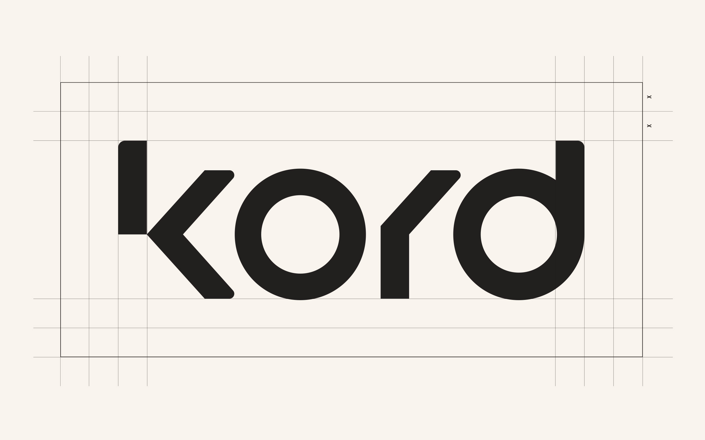
The logotype embodies simplicity and precision—an understated wordmark that emphasizes clarity while allowing subtle typographic details to communicate personality. Every element—from spacing and proportions to color interactions—was defined to create a sense of cohesion and quiet confidence.
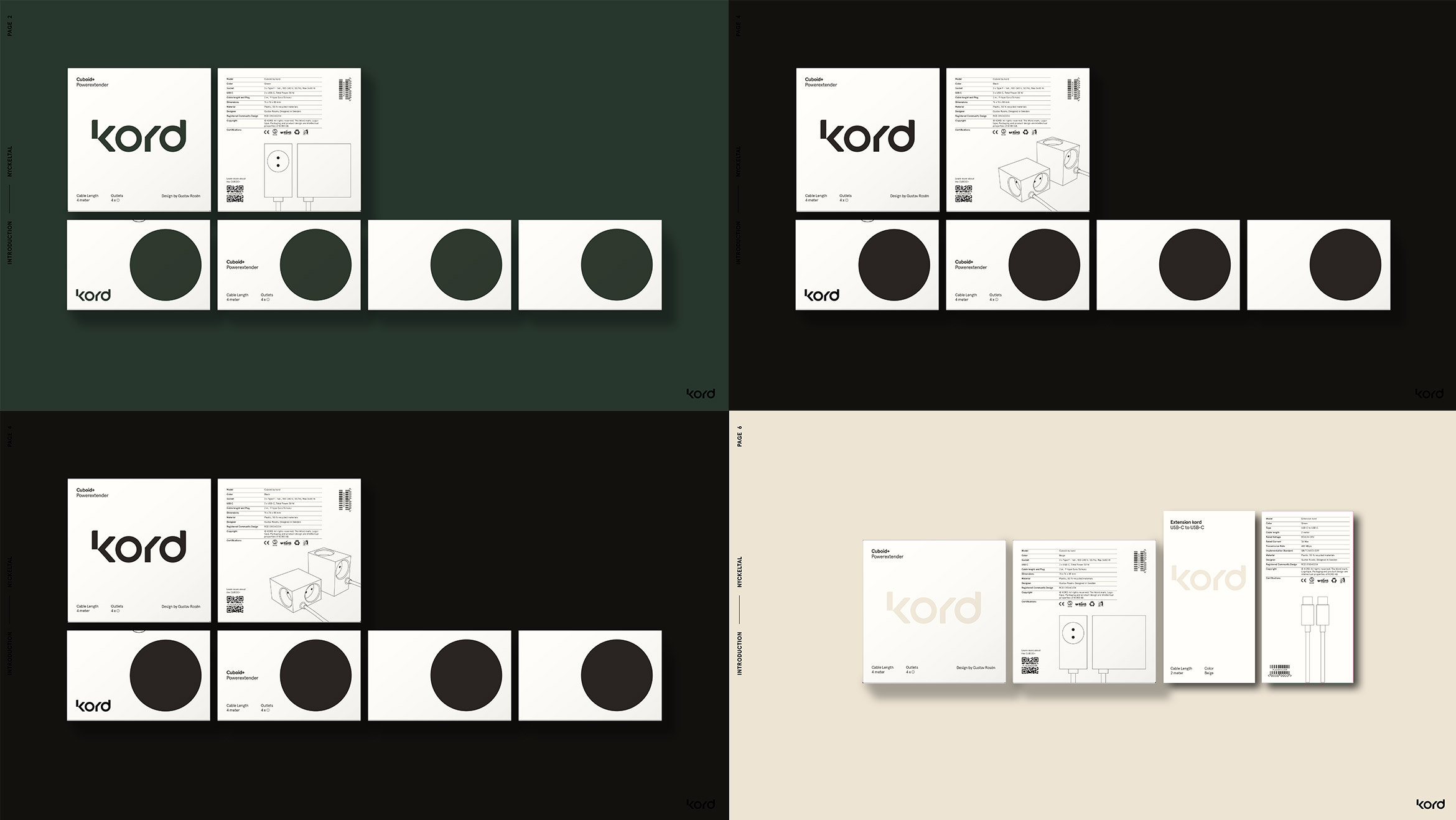
The visual identity positions Kord as a brand built on connection and purpose. It is a system designed not just to decorate but to communicate—flexible enough to adapt, yet consistent enough to build recognition over time.